We interact with colors so much that, consciously, we may not pay them much attention. But colors have a powerful influence over us. They generate emotional responses and play a large role in determining our thoughts, attitudes, and feelings toward the world around us. In fact, color can influence up to 90 percent of our initial impression of a product. For the team at PRIME, color is a constant factor in our marketing strategies. Keep reading to learn the role color psychology plays in marketing and branding.
Basics of Color Psychology
The main idea of color psychology is that different colors carry different associations and trigger unique emotional responses. And while many colors have commonly recognized associations, there are no definitive rules. Color perception and preference is influenced by culture and personal experience. That’s why knowing your audience is so important when choosing color for a brand. But it is helpful to understand how certain colors usually make people feel. Let’s look at a few examples.
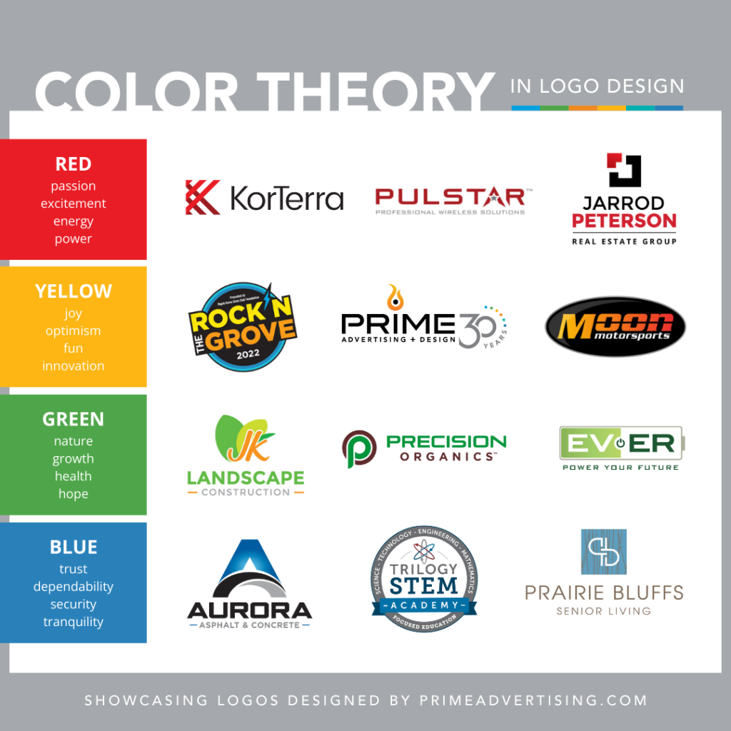
- Blue evokes feelings of trust, dependability, security, and tranquility. It’s a common color choice for banks, hospitals, and other brands that require large amounts of trust from their clients.
- Red communicates passion, excitement, energy, and power. It’s used by many entertainment brands to generate excitement for their products. It’s also common in the food industry for its tendency to make people hungry.
- Green is associated with nature, growth, health, and hope. It’s a great choice for brands who want to convey a connection to the Earth. Environmental organizations, outdoor companies, and food brands make common use of green.
- Yellow evokes feelings of joy, optimism, fun, and innovation. Consider brands such as Snapchat, McDonalds, and National Geographic that use yellow’s positive connotations to draw people in.

The Role of Color in Branding and Marketing
Colors increase brand awareness by 80% and influence up to 85% of purchasing decisions. Since an organization’s entire marketing strategy flows from their brand identity, choosing the right colors to build that brand on is vital. Whenever we conceive a new brand or refresh an existing one for a client at PRIME, color is one of the first things we consider. There are a few factors that go into choosing these colors.
How The Client Wants to be Perceived
Colors should match the intended feel and mood of an organization. Does the client want to appear dependable? Fun? Environmentally conscious? Then their brand’s colors should support that. Related to this idea is how the client wants their audience to feel. Should the audience be excited or inspired? Is trust the primary goal? This is where choosing a combination of primary, secondary, and accent colors to convey multiple feelings can be advantageous. Just don’t use so many colors that your brand loses its identity in the mix.
The Client’s Industry/Market
Utilizing common industry colors is a sure way to communicate what your brand is and where it fits. But you also want to stand out from the crowd. It’s important to consider both concepts when designing a brand. Industry standard colors are generally a safe bet. But unique colors, while risky, make more of a lasting impression on audiences.
Let’s look at an example. The vast majority of fast-food restaurants use red and yellow in their branding. As we mentioned earlier, red generates excitement and hunger while yellow conveys happiness and fun. On the other hand of the color spectrum, the food industry usually avoids blue because of its rarity in naturally occurring foods. But one of the most popular chains here in the Midwest has utilized blue to great effect—Culver’s.
Intended Audience
What demographics are you targeting? Homeowners? College students? Retirees? What do they look for in a brand? How will they react to certain colors? How can you communicate that your brand is right for them? Most colors will convey similar ideas to most people. But it’s worth considering which ideas your audience looks for in a brand and whether culture, age, or gender may alter their perception of color.
The Power of Color
A strong brand identity is essential to your organization or business, and color is your greatest tool for building one. Are you considering re-doing your logo or changing your brand colors? Whether you’re looking to refresh your brand or build a new one from the ground up, you can rely on PRIME to provide a solution that resonates with consumers and captures your unique identity. Contact Prime Advertising + Design, and we will put our color knowledge to good use.


