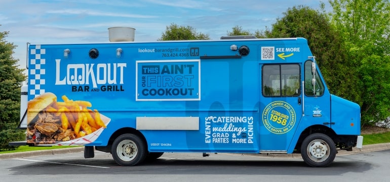
As a full-service marketing agency, we enjoy putting our talents to work for our clients. Recently, we had the opportunity to tap into our innovative resources for an ambitious and impressive project. Keep reading to learn more about this PRIME client spotlight on the Lookout Bar and Grill, for which we pulled out all the creative stops.
A PERFECT OPPORTUNITY
With a host of plans, designs, and ideas on the horizon, one of Maple Grove’s favorite hangouts strapped itself in for a smooth ride.
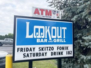
And because of PRIME’s extensive capabilities and proven track record, the driving force behind the Lookout knew exactly where to turn. “We needed help with everything from our logo to our food truck and trailer designs to sponsorships,” the Lookout owner Mike Kinnan said. “As a one-stop shop, we knew PRIME could provide all our marketing needs.”
“We did a lot for the Lookout,” said PRIME Art Director Brian Lauer, who spearheaded this heavyweight project.
That included a new-look logo, thoughtful branding elements, custom-designed apparel, and specialized graphics for vehicle wraps — just for starters.
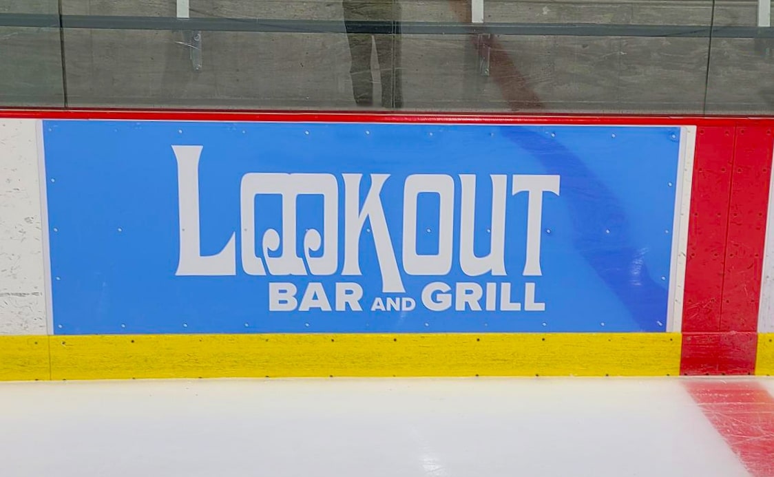
THE LOOKOUT LOGO REVISION
Lauer noted that a logo redesign offered the chance to both update and refresh the Lookout’s old-fashioned feel.
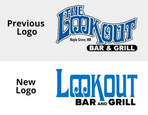
Using the same font, Lauer cleaned it up for a sleeker and more modern feel — as well as versatility, which we’ll touch on more in a minute. In addition, he rejuvenated the color to breathe new energy into this design while maintaining some of the originality of the Lookout’s generations-old sentiment.
“We used a brighter, more radiant blue, just to bring some new life into this,” Lauer said. The fresh color adds an electric, eye-catching element that is also seen throughout the other components PRIME designed for the Lookout.
STRIKING GRAPHICS AND VEHICLE WRAPS
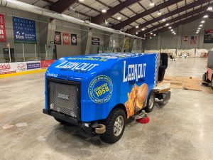
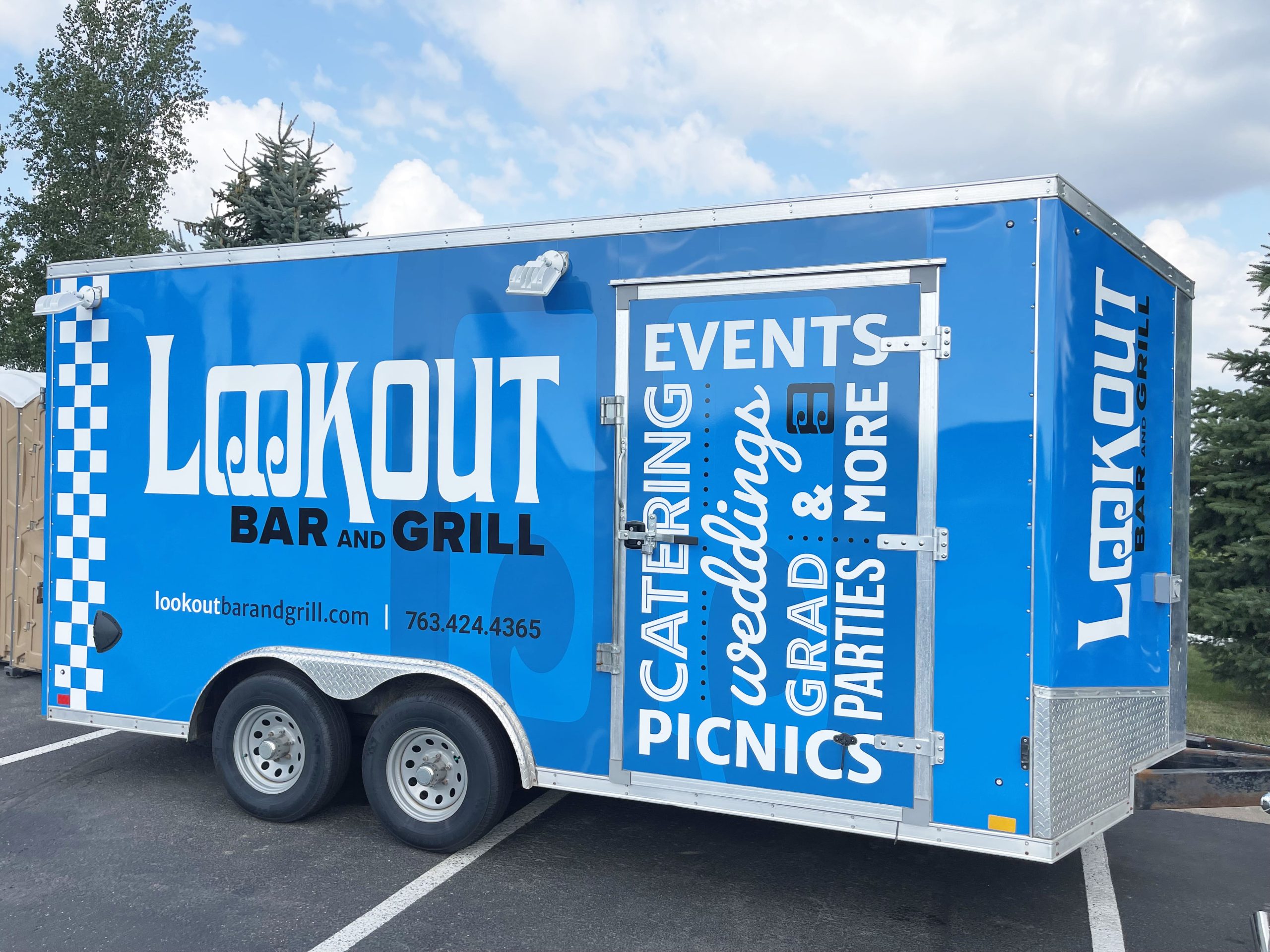
Anyone who spots the Lookout’s food truck will surely notice that new pop of color that simply demands attention. That’s intentional. PRIME also deliberately designed the Lookout’s vehicle graphics — on its food truck as well as on the Olympia ice resurfacer at the Osseo Ice Arena — for the best placement and highest visibility.
“Based on our experience with vehicle graphics,” Lauer stated, “we kept in mind where things needed to land on the food truck. We wanted to ensure these features are easily seen, whether the vehicle is on the road, parked somewhere, or at an event.”
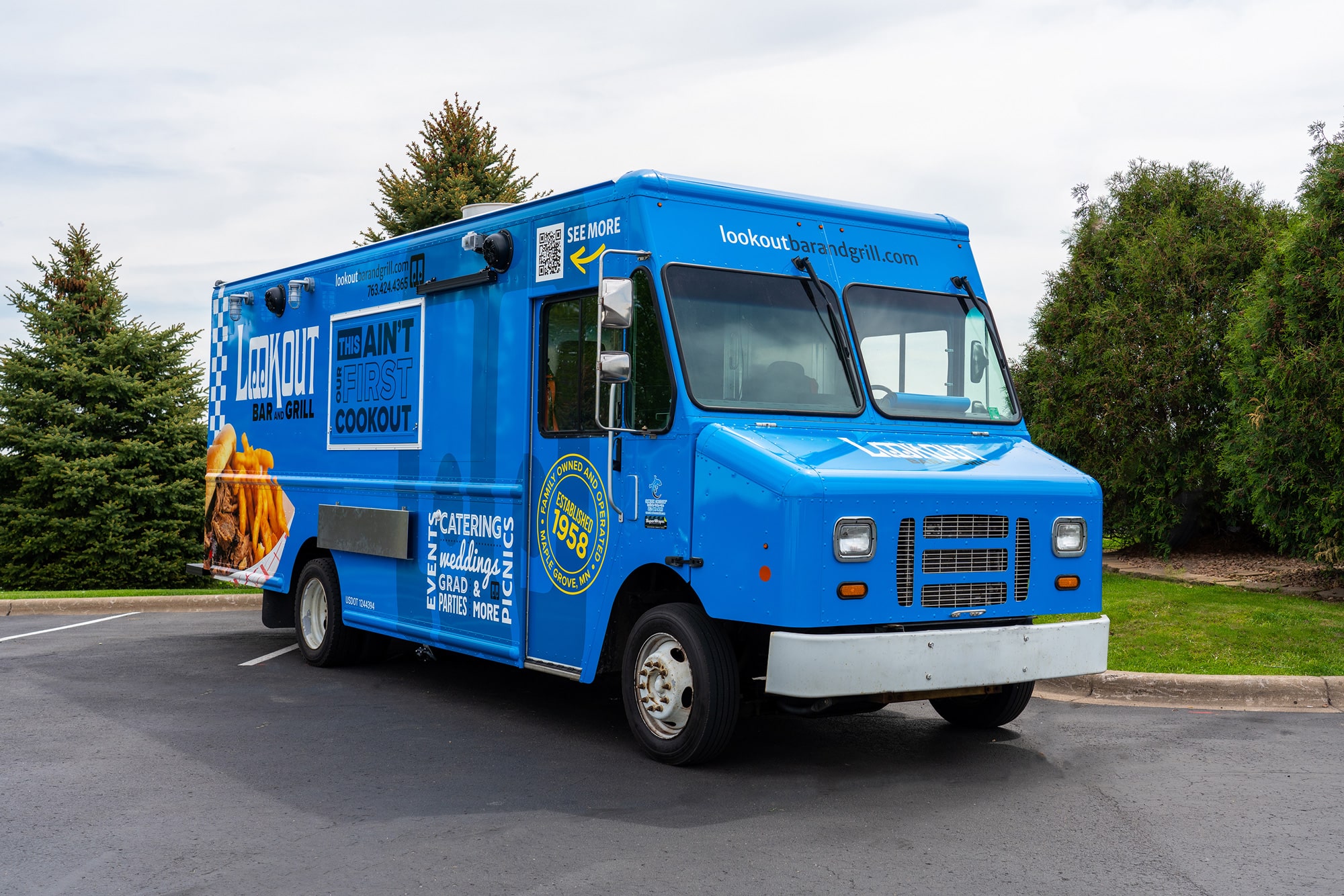
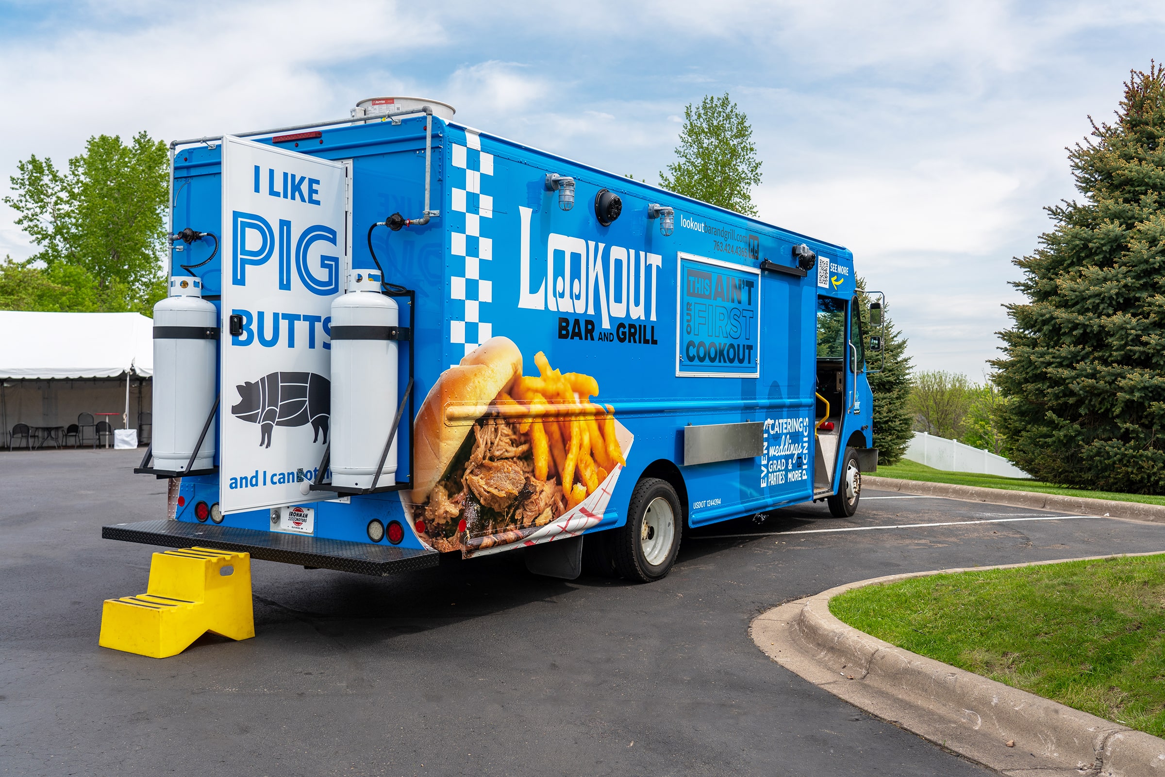
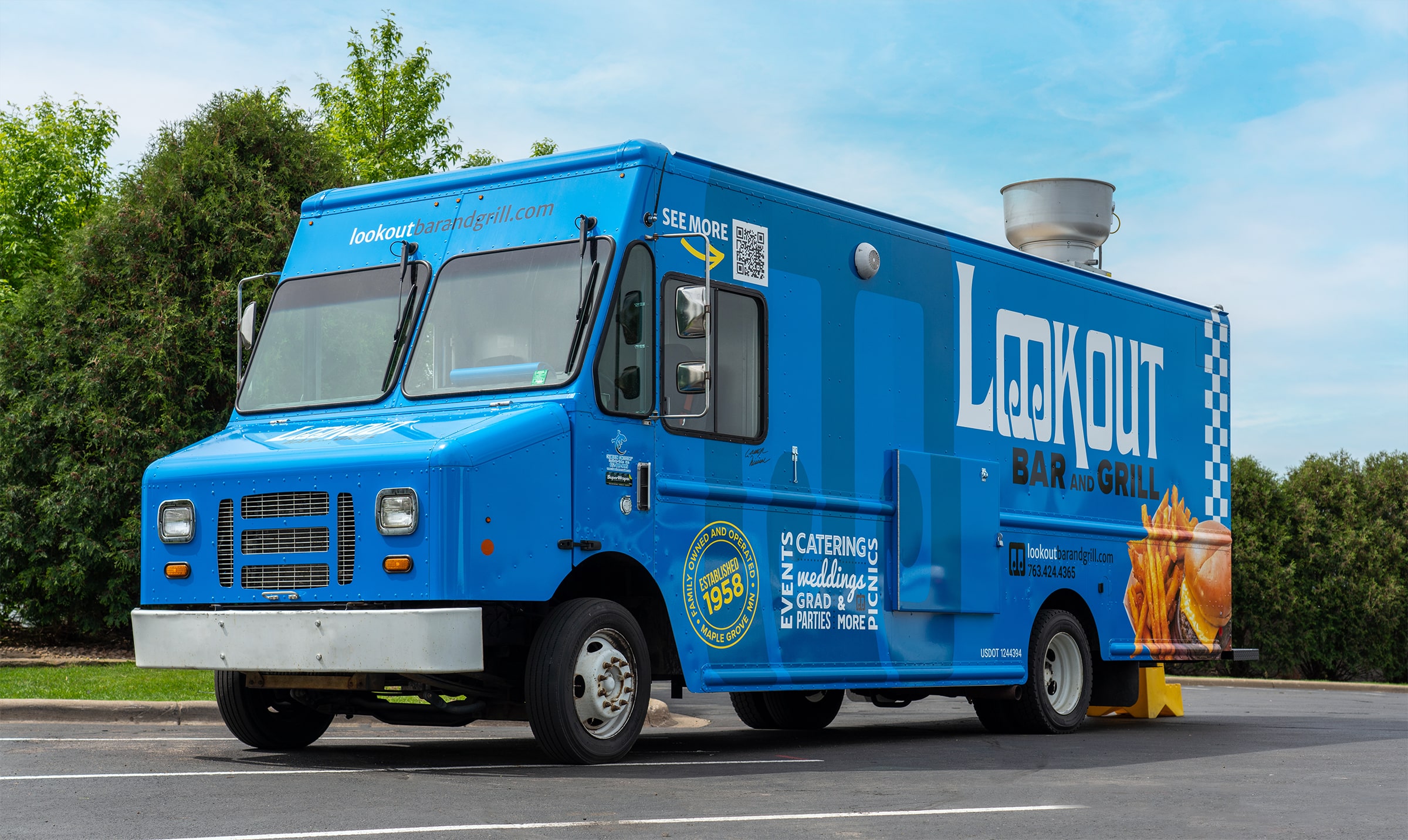
Lauer then described the logic behind elements like the pop-up window, which is adorned with the branded mantra “This ain’t our first cookout.”
“When that window flips up,” he said, “we’re not losing any of the other branding.”
Lauer worked closely with Mike Kinnan’s son and third-generation operator, Camryn Kinnan, to make sure the food truck’s new look and feel was on point and on brand.
True to course, the Lookout’s logo and the word bank highlighting all its services are unmistakable. Additionally, Lauer noted, the QR code is prominently and plainly displayed above the truck’s curbside window.
One other piece to the overall design highlights this enterprise’s third-era longevity and adds an intense burst to complement that energetic blue. “That ‘established in 1958’ seal is yellow to introduce a vibrant pop to the color palette,” Lauer said.
“We definitely took everything into account to make sure the truck looked good straight on and also in the round,” Lauer added.
PRACTICAL AND DISTINCT BRANDING
Along with its “cookout” mantra, the Lookout’s logo retained another familiar and important detail — a subtle visual piece that also preserves a hint of the old logo.
“We’ve used that double O as another branding element,” Lauer said. “You can see it almost like a watermark on the vehicle graphics, and it’s still an essential part of the updated logo.”
The modernized logo also designed away that old-school wave effect, opting instead for a bolder and definitive presence. With that, Lauer said there’s added versatility to how the logo is displayed, which is especially helpful with the apparel.
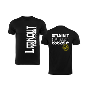
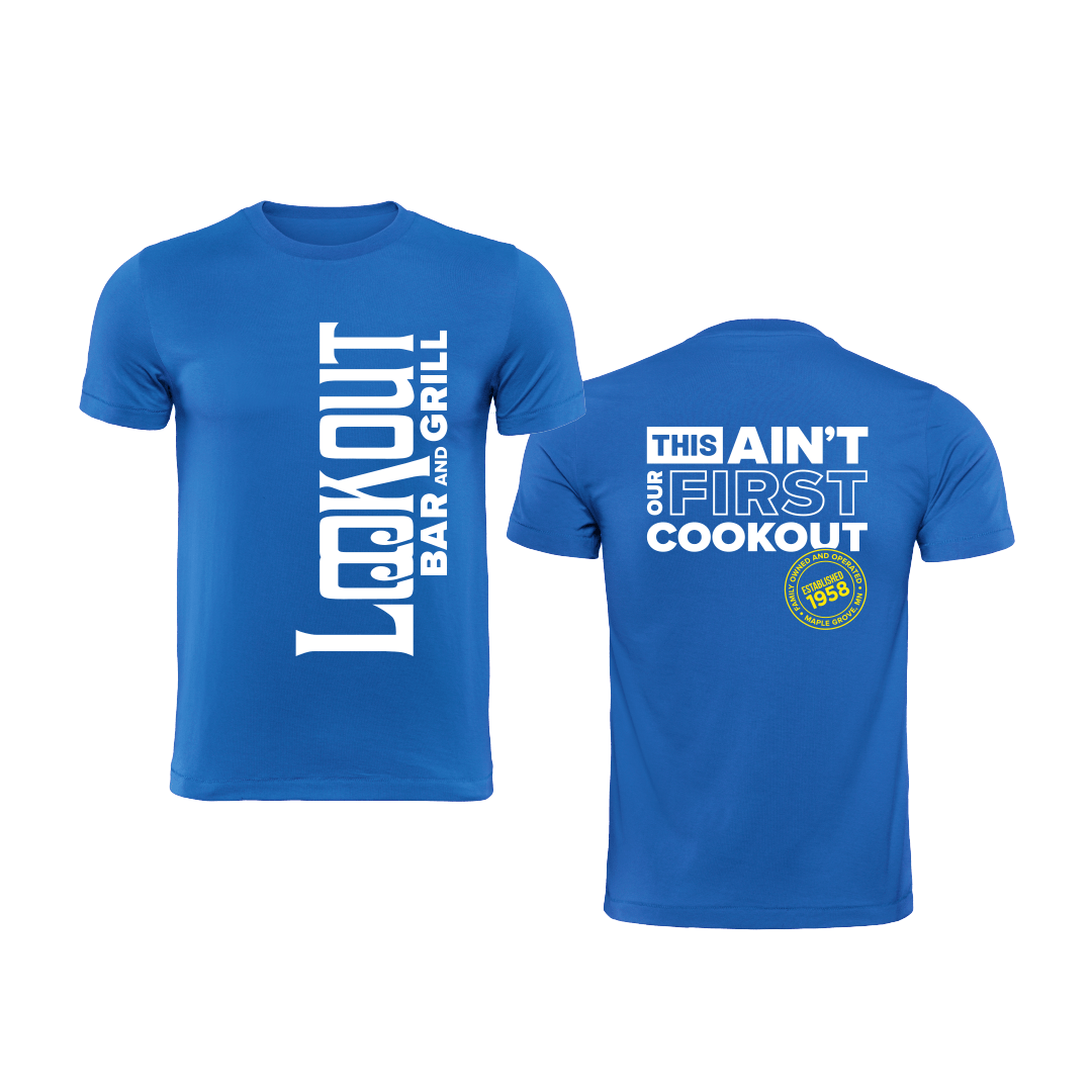
“The new logo can be used horizontally, which is kind of the traditional, corporate way,” he said. “But we can take it one step further, like with the T-shirts, and turn it vertical. And it’s still a legible focal point.”
Everything considered, a satisfied client is the most rewarding aspect of a project of this scope. And Mike Kinnan was more than happy with the results.
“They did a great job updating our logo and bringing our brand together,” he said of working with PRIME. “We love our new image, and we owe it all to the PRIME Team.”
OUR CAPABILITIES DON’T STOP THERE
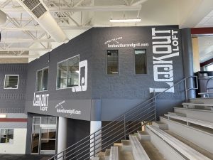
PRIME also partnered with the Lookout for the graphics and design elements of the Lookout Loft, located inside the Maple Grove Ice Arena. In addition, Lauer noted, “They have some other trailers that we designed and re-wrapped with that bright, high-energy blue look and feel.”
As you can tell from this PRIME client spotlight on the Lookout Bar and Grill, our capabilities are far reaching and seemingly endless. If you have a marketing project in mind for your business, the PRIME Team would love to help make it happen. Contact us today and let us put our talents to work for you.

