Composed by Ben Redpath, Multimedia Designer
Article from WebDesignLedger.com with designs and images from PrimeAdvertising.com
As many know, the web technology industry is fast changing, and new trends are cropping up constantly. Just within the past quarter, we’ve seen a large move towards new and exciting web design standards. Prime’s web design and development services is a large part of what we do, and it’s our job to stay knowledgeable on designs that deliver the greatest mix of creativity, usability and functionality.
2013 saw a slew of new trends, some of which have begun to fade out and others that stuck around and are still going strong. Let’s take a look at some of the web design trends that have started to emerge as we sail through 2014.
Flat Design
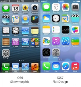
 Flat Design was one of the biggest trends to emerge in 2013 and it is going strong into the new year. Companies from Taco Bell to Apple are dropping skeumorphism in favor of flat design by stripping their graphics of pretty much any design element that isn’t 100% purposeful in the function of the product. Apple, for example, launched their iOS7 with an extreme flat design, stripping the design elements until they were stark naked. This involves getting rid of 3-D graphics and gradients and basically just using flat shapes and indicators to help the user have a more accessible experience.
Endless Scrolling
![]() Scrolling through a website is faster and easier than having to click through links to access various information. They are not the content-cluttered long scrolling pages of the past, either. New design techniques allow the content to be impeccably organized and formatted in a way that’s super easy to read and digest. Long scrolling site can change layout and design as you’re scrolling, which makes it easy to forget that you’re actually scrolling through quite a bit of information.
Scrolling through a website is faster and easier than having to click through links to access various information. They are not the content-cluttered long scrolling pages of the past, either. New design techniques allow the content to be impeccably organized and formatted in a way that’s super easy to read and digest. Long scrolling site can change layout and design as you’re scrolling, which makes it easy to forget that you’re actually scrolling through quite a bit of information.
For a cutting-edge, interactive example of a long scrolling site, visit the website below:
http://www.qzwei.com/
Simple Color Schemes
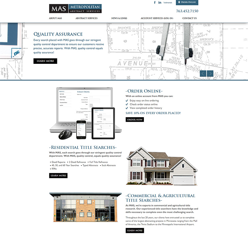
2014 is seeing a lot more websites using only one or two colors instead of the eye-popping graphics and animation of the past. A new trend is to use one bright and clean background color, like red, orange or teal, and to include images or black or white text over it. The effect is super minimalist and user-friendly. One of Prime’s most recent websites designed and developed by Prime Advertising& Design was created with this trend in mind. You can view the live site here: www.metropolitanabstract.net
Focus on Mobile
Responsive Web Design was another big trend in 2013 and now 2014 is seeing websites designed expressly for mobile use. Designers are working more and more on keeping sites functioning on mobile devices and developers are helping the cause along too. Things like logins, social media integration, email subscriptions, endless scrolling and many other features are making sites much, much easier to use on phones, which is where most users are turning these days. One important deciding factor in whether a website should have a full responsive design (desktop, tablet, mobile) or a dedicated mobile site to complement their desktop is how the customers are using the current site. This information can be gathered using Google Analytics. With Prime’s help, we’ll identify which route is right for your company and your customers.
Our web department of designers, developers and programmers are constantly educating themselves on design and functionality trends that will benefit our customers and their businesses. Some web trends only last a few months, others prove to take the industry to whole new levels. Count on us to keep you up-to-date on what’s new, and what’s going to make your website memorable and functioning optimally to bring in new customers in 2014.
To read more about 2014 web designs, you can read the full article at WebDesignLedger.com.


Leave a Reply
You must be logged in to post a comment.