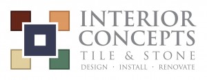
The logo process from Ben’s (Multimedia Designer) point of view:
“I wanted to make sure that the icon I designed would be easily readable as tile work, but not necessarily easy work to do. Since tile work can be complicated, I wanted to develop an icon to help promote the client’s ability to handle intricate projects. I added a border to each of the smaller squares in the logo and made sure the larger square would ‘knock out’ the corners of the smaller ones. I feel these little tweaks added enough complexity to the icon to help represent a company that is familiar with elaborate projects.
The colors I chose to incorporate into the icon were actually taken directly from photographs of the client’s work. Interior Concepts has done a wide variety of projects, and almost all of them used tiles having earth tones similar to the icon.”
Once the logo was approved, we incorporated it into new business cards and a redesigned website. The website was built on Prime’s Element Z content management system (CMS). Our CMS allows Interior Concepts to easily make text edits and keep their photo galleries up-to-date.
Click on the thumbnails below to see the “before” and “after” of the website.
[nggallery id=10]
When developing the new website, we also added social media and you now can become a fan on Interior’s Facebook page.


Leave a Reply
You must be logged in to post a comment.