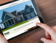
Last Friday we rolled out another re-design for a current client and also added upgraded interactivity for the client’s customers. Medici Development wanted a fresh look and smoother flow where navigation was concerned, so we extended the new layout to accommodate the trend of higher resolution monitors and implemented a better navigation structure than was previously used. We also included an interactive area attraction map, which utilized the Google Map API to develop an interactive way for users to view local attractions around Medici Development communities.
Our goal was to have the new site live by the Fall Parade of Homes, which gave us just a few weeks to plan, design, program and test the new site. We accomplished that goal and also learned a valuable lesson in teamwork. We came together as a team to make sure that every piece of the new site not only worked, but would make sense to the average web user. Many times we get so used to working on a site in our own element that it can be hard to step back and view it as an average web user would. Having our team members to fall back on and discuss ideas with helped us collaborate on items that may have been passed by as individuals.
Check out the fresh look and cool new interactivity of Medici Development!


Leave a Reply
You must be logged in to post a comment.